Button List
Description
The Button List displays a series of buttons in either a vertical or horizontal orientation.
- Name
- Description
- Dynamically Hide or Show and Enable or Disable Buttons in a Button-list
You can use Javascript to dynamically hide or show and enable or disable buttons in a Button List control. You can also dynamically add and remove buttons from the Button List.
- Using a Button List Control to set Active Panes in a Tab Control
A common design in a tab control is to have a series of tabs along the border of the control. When the user clicks on a tab a corresponding pane opens. The Button list control can be used to replace the tabs on a tab control, such that clicking on a given button will open a corresponding pane.
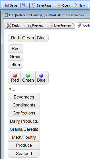
Depending on how the Button List is configured, either one button in the Button List or multiple buttons can be selected. When a button is 'selected', it is rendered as depressed. Buttons can be displayed as text only, image only, or image and text. When displaying images and text, you can configure the image to be left, right, above, or below the text.
Unlike a regular button, which has events, the individual buttons in a Button List do not have events. Instead, you can define an onSelect or onClick event for the Button List as a whole.
In the event handler you can refer to this.value to get the value of the button that was clicked on. The onSelect event is fired whenever the value in the Button List is changed programmatically (using the {dialog.object}.setValue() method) or when the user clicks one of the buttons.
The onClick event is only fired when the user clicks a button. When the onClick event fires, the onSelect event will also fire.
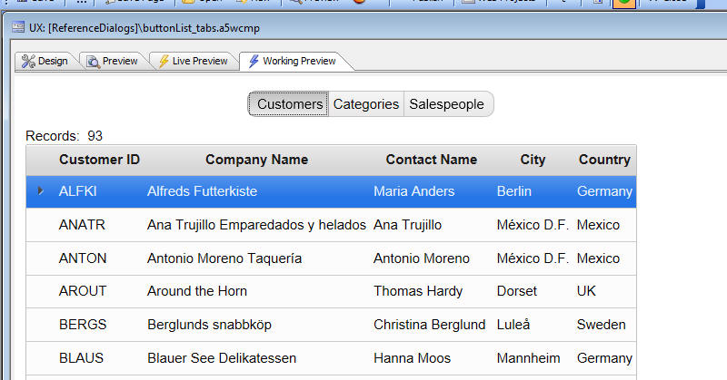
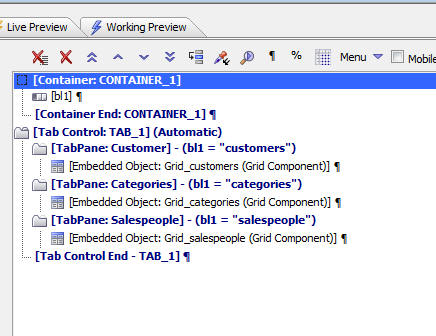
A common use case for Button Lists is to select the active pane in a Tab Control (much like you would see in an iOS application). In the image below, the Button List selects the active pane in a Tab Control (shown in the builder in the following image).
This image shows a Tab Control in a UX component. The method for selecting the active tab pane has been set to 'automatic', and the expression for each tab pane has been set to watch the value of the selected button in the Button List.
Another common use for a Button List is for radio button and checkbox controls in mobile applications.
Using the Keyboard to Select a Button
If the Button List control is used in a web application, the user can use the keyboard to select one of the options by clicking the "Enter" or "Spacebar" key when a button has focus.
It is important to note that some styles may not provide visual cues for when a button has focus in the Button List control. You may need to modify your style sheet in the Web Theme Builder to enhance your application to provide visual cues when a button has focus. For example, the CSS below when added to a tweak for the Alpha Style will add a 3px border to a button in a button list when it has focus:
.buttonGroupFirst:focus, .buttonGroupMid:focus, .buttonGroupLast:focus {
    border: 3px solid rgba(0,0,0,0.25);
}
See Also